THE RIPE STUFF
10 Jun ‘15
Explorations in Daily Design & Marketing Follies
10 Jun ‘15
In: Branding & Visual Design, Business, Los Angeles, Marketing, / By: Heather Richman
As a Creative Director, out in the world, I’ve developed a habit of perpetually taking in and subconsciously redesigning or rethinking almost all that I see. Often I come across designs that are cringe worthy, marketing messages that completely miss the mark and typography that defies all logic.
It is a marketing truth that the game is no longer reliant on budget or who has the deepest pockets. The playing field is based on nimbleness and strategy. While a design faux pas once in a while is surmountable, a lack of investment in expertise creates a pattern of missteps that can result in a critical blow to any brand. This installment of Daily Design & Marketing Follies spotlights a small business and its efforts to capitalize on an opportunity presented by all people – Mr. Harry Potter.
Viola! A Marketing Opportunity Presents Itself
As many of you Potterheads already know, Universal Studios Hollywood has begun a significant 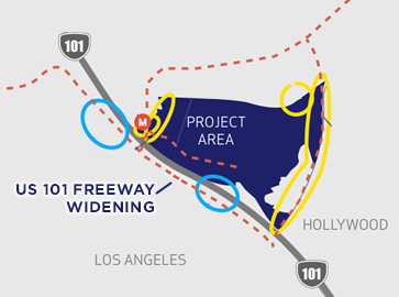 expansion to make way for the highly anticipated Wizarding World of Harry Potter coming in 2016. Along with park expansion there is also some infrastructure changes underway to accommodate for the increased traffic to the area. The Ripe offices just so happen to be located across the street from Universal Studios and our proximity has provided a front row seat to the area’s transformation.
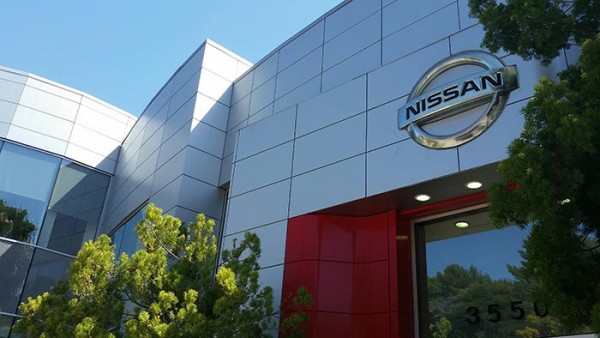
When driving into work on the southbound 101 freeway, I noticed that as a result of the construction work and expansion of the freeway that a Nissan dealership could now be clearly seen. It was as if Harry with his magic wand shouted rennervate! and blammo the dealership appeared out of thin air for all consumers to see and consider. What an unforeseen windfall for this small business and I wondered what they would do with this pretty epic opportunity.
Analysis of the Campaign
It was clear that the Sage Nissan dealership was keenly aware of their new visibility as advertising and signage sprouted up all over town. Let’s see what they did.
Per the sampling of photos below, it is apparent that a significant investment was made in the media coverage or placement. If you’re driving past the store or the surrounding area you will not miss this campaign. Unfortunately, this design approach and its weak messaging will not compel potential customers to visit the store.
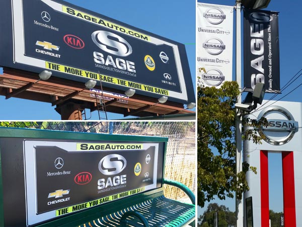
All dealerships must contend with the smarmy reputation that car dealerships have in general. The dark black background and license plate shtick are so commonly used that it shouts – “My nephew and I just threw this thing together. And shopping at our store will be the same annoying and cheesy experience you’d get anywhere. Come on down!” I would say that the logo with the stainless steel gradient is dated but I don’t believe that was something that was ever popular. All this amounts to a very unappealing appearance. What may be happening is that people are more aware of the dealership just by exposure but you have to do more than that for there to be a return on your efforts.
Strengthening your brand through design
From a design perspective, I suggest tapping into and using the Nissan brand identity more closely. Their most recently published style guidelines have a flat aesthetic that feels fresh, appealing and welcoming. They paid millions of dollars to develop their identity system – use it because it works and it ties you to a brand that people recognize. Although I can tell you that the Nissan color palette lacks depth and presents design challenges of its own. But the key takeaway is to use white more to brighten up displays and the solid red with flat elements for a more on-trend, current look. The expertise of a seasoned and prolific art director will change the reaction to and resulting impact of the collateral.
What about the messaging?
Improving the design can go a long way but the root of the problem is the lack of strategic thinking. Certainly something better could be said then just “Hey we’re here and we’re cheap.” This is the prime opportunity to introduce your business.
I suggest furthering the concept of the “introduction” by adding a warm, human element. I envision bright red banners across the lot with photos of staff and their first names. Seeing these friendly faces changes the story and message entirely. Not only will I be made aware of the dealership’s existence, I will perceive that a visit to the store will be a pleasant, welcoming experience. I guarantee you that a prospective customer is more likely to visit a store that they are drawn to rather than one that they are just faintly aware of.
Keep calm and invest wisely
Again, a big budget is not the answer or the way to turn this around. But investing in strategy and tapping into the resources provided by the highly-valued Nissan brand is the path to redemption. It’ll be a big win if the current campaign is replaced with a message that is well thought out and connects.
At Ripe, our rallying cry is to seize the opportunity to cultivate a brand, stimulate business development and to further the design aesthetic of the world around us. If you’re into creating smart digital products and capitalizing on opportunities then partner with an agency that does the same!
-Heather Richman, Creative Director @ Ripe
At an early age, Heather was fascinated by design and the effects of imagery on perception and emotion. Over time, these ponderings developed into creating art and studying printmaking, photography, and art history. For over fifteen years, she has built distinctive brand identities through print, web, and interactive work.
Heather is passionate about finding the right typeface, creating compelling designs, and wowing the client with her impeccable ability to visualize and verbalize a project’s goals. Her designs are like her laughs – irrefutable and infectious.
You Might Also Like
Related Posts


Share this: