THE RIPE STUFF
2 Apr ‘15
Why Apple’s Safari 8 is Horrible UX
2 Apr ‘15
In: Rants, Technology, User Experience Design, / By: Ripe Media
OSX is great, so why is Safari so horrible?
The Mac vs. PC debate is just one of those arguments that is destined to live on forever. PC users call Apple-ites fanatical cultists while Apple enthusiasts mock the plasticky-coldness of Windows-based machines. Ultimately I think the answer to the debate is something much more personal and far less logical: people like what they like because they like it. End of story.
I preface my post with this, because the popular sentiment from the Windows-side, “Apple just sucks,” doesn’t hold up from the UX side of things as a general rule. User-experience design is one thing that Apple does really well. To mark my one-year anniversary with Ripe Media, Heather and Chris were kind enough to give me a copy of Don Norman’s The Design of Everyday Things. According to Mr. Norman, UX was, “a term that I was among the first to use, when in the early 1990s, the group I headed at Apple called itself ‘the User Experience Architect’s Office.'” Apple didn’t invent UX design, but it certainly has played a critical role in codifying it as a cohesive discipline.
OS X Yosemite is a beautiful piece of UX.It’s clean and slick, and easy to use. It’s a Unix-based OS, so it’s fundamentally solid and reliable. So, pat on the back there, Apple. But what is so bad about Safari 8?
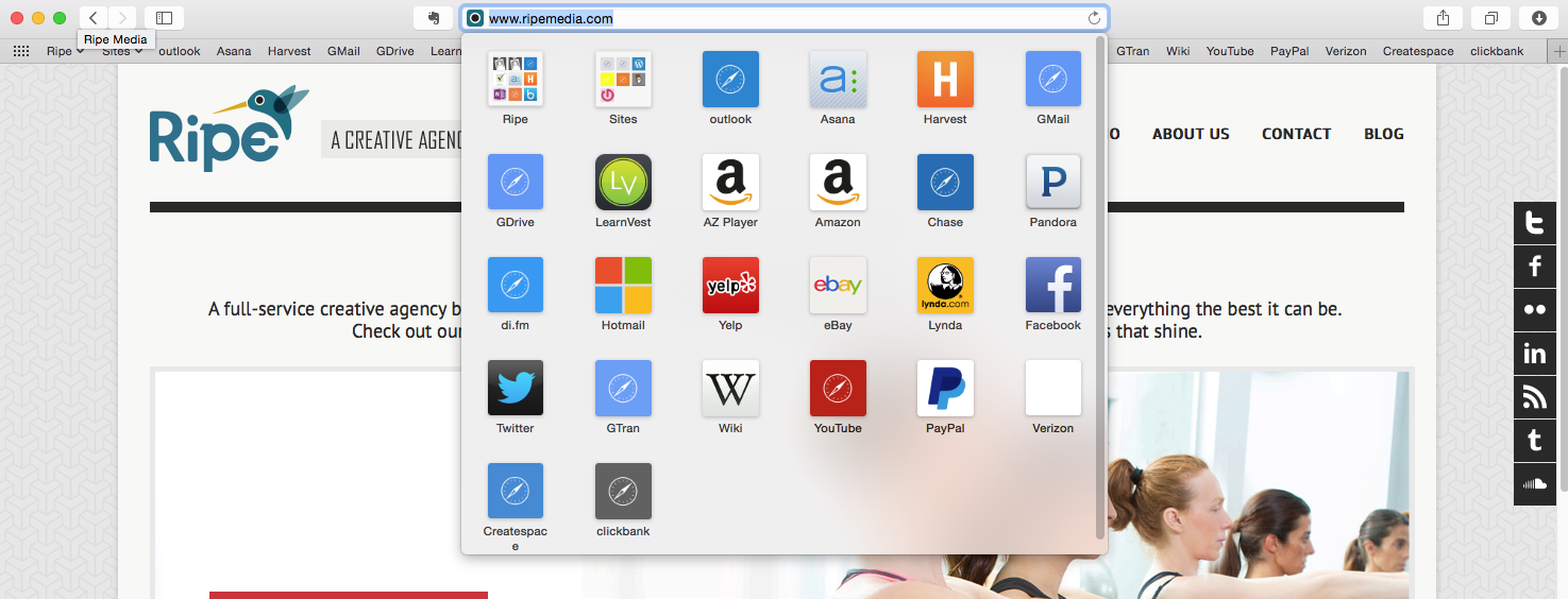
1. Don’t make me read
![]()
Safari doesn’t allow for the presence of favicons in the bookmarks bar, which means that you have to visually scan and read the actual contents of each bookmark. The direct-recognizability by icons as a visual reference is a well-established piece of UX has that has long been used in street signs.

To counter this, Apple might say that the icons for your most-commonly used bookmarks present themselves to you when you click the address bar. This is poor UX because 1) it isn’t eminently obvious that your bookmarks are there, 2) this is an extra step and 3) it disturbs the line of sight from cursor to bookmark. The same is true with Safari’s left-hand bookmark panel. By tucking away the bookmarks, Apple thinks it’s clearing up space, but this adversely affects the speed and ease of use for quickly accessing commonly used sites.
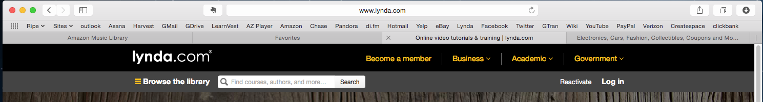
Compare this with Chrome’s answer to the bookmarks bar:

Favicon-based bookmarks are so effective that one could easily delete the description from all of them and each would be immediately apparent and instantly locatable. No reading across the bar would be required.
2. The ever-moving tabs problem
If you’ve used Apple’s word processor Pages, it will be clear to you that the developers were trying to strip away functionality. Such a “bare bones” approach works well for tablet and phone interfaces. However, Pages doesn’t live up to its rivals: it can’t manage a database of references, which Microsoft Word has been able to do for nearly twenty years. This move toward “minimalism” seems to have stuck again with Safari. To save screen space and clutter, Safari shows no tabs until you open one. This is divergent from Chrome and Firefox, which always start you off with one tab. I think this is very helpful in terms of UX – it immediately familiarizes the user with the tab structure and lets the user know where their original tab was when new tabs are opened.
Safari doesn’t work that way. First there are no tabs, then you open a new tab, and poof! Now you have two tabs! Safari then splits the tabs, full-width across the entire window. All open tabs will be split evenly across the screen, so if you have three tabs open, each will run one-third of the window width.
This UX pattern works great for mobile Safari on a tablet or an iPhone, but not for the desktop. Why not? When you’re touching a screen with your finger, the size of the buttons definitely improves usability. Splitting the tabs across the entire screen was a very good move on Apple’s part, because when you’re relying on your big mitts to do the interactions, larger objects are always easier to interact with. However, this is a moot point with a mouse-and-cursor. If the tabs are 100% of the width, then I have to travel my pointer to an endless series of constantly-moving targets. In the screenshot above, take a look at what happens when browser tabs are closed in Safari. The cutoff points between tabs never stays the same. Your mind attempts to memorize where the tabs originally were, but Safari is constantly throwing that off by resizing the tabs.

Chrome and Firefox do it right by maintaining the same tab size and location, regardless of how many tabs you have. They don’t start reducing the size of each tab until you have completely used up the complete horizontal width of the window. Whether you have one tab open or six, you can always count on your tabs staying put, and the favicon’s presence in each tab doesn’t hurt either – something that Apple has stripped away as well.
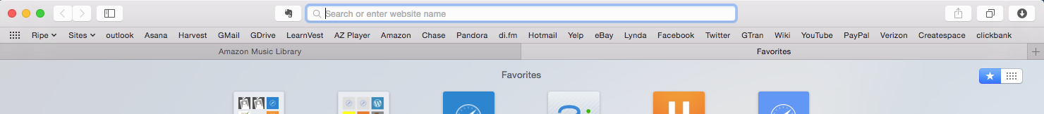
3. Downloads – you better stick to one folder.
![]()
With Safari, you can’t select the location for your downloads on a case-by-case basis. Safari forces you to select a folder to download and stick with it for all downloads, leaving the user to move files about on the OS side once the download has wound up in the unintended place. What is especially moronic about this is how poorly it mates up with OSX’s phenomenally designed app management system, just drag the file to the apps folder and you’re done! Naturally users will want to download apps straight to the ‘apps’ folder or music straight to ‘music’ folder, but so much for that!
 To see it done right, take a look at Chrome – it’s what users expect in a browser.
If you don’t use bookmarks very often, or aren’t a serial downloader, Safari isn’t a bad choice. The integration between Safari and other Apple devices is just astounding. Safari allows you to look at what was recently opened on each iOS device so you can pick up where you left off. Safari is also stable, very fast, and light on system resources. The reading mode is fantastic for eliminating screen clutter when reading long articles. However if multi-tab browsing is your thing, I strongly encourage you to conduct this UX experiment yourself – see which is faster Chrome/Firefox or Safari when it comes to routine tasks like finding a bookmark or switching tabs. You’ll soon discover that Safari doesn’t live up to Apple’s high standards.
You Might Also Like
Related Posts


Share this: