
THE RIPE STUFF
25 Mar ‘15
UX Trends and Tombstones for 2015: Part 4
25 Mar ‘15
In: Branding & Visual Design, Business, Mobile App Design & Development, User Experience Design, / By: Ripe Media
In Part 3 we discussed the importance of fun and casual language and design in a company’s overall digital brand. In the final part of this series, we’ll discuss the full-screen browser experience and its importance in 2015 and beyond, as well as the popularity of gamification and its importance in the grand scheme of things.
We see a lot of attention given to mobile apps and responsive-capable sites these days, and based on what we mentioned before, this is exactly what you should be focusing on for your digital strategy. However, the downside to this is that the good old-fashioned 1000+ pixel website is getting pushed to the wayside as an inferior art. Please do not assume that the full-experience website is an inferior art – this is NOT the case. A large amount of your visitors will still be interacting with your brand using this tried-and-true medium.
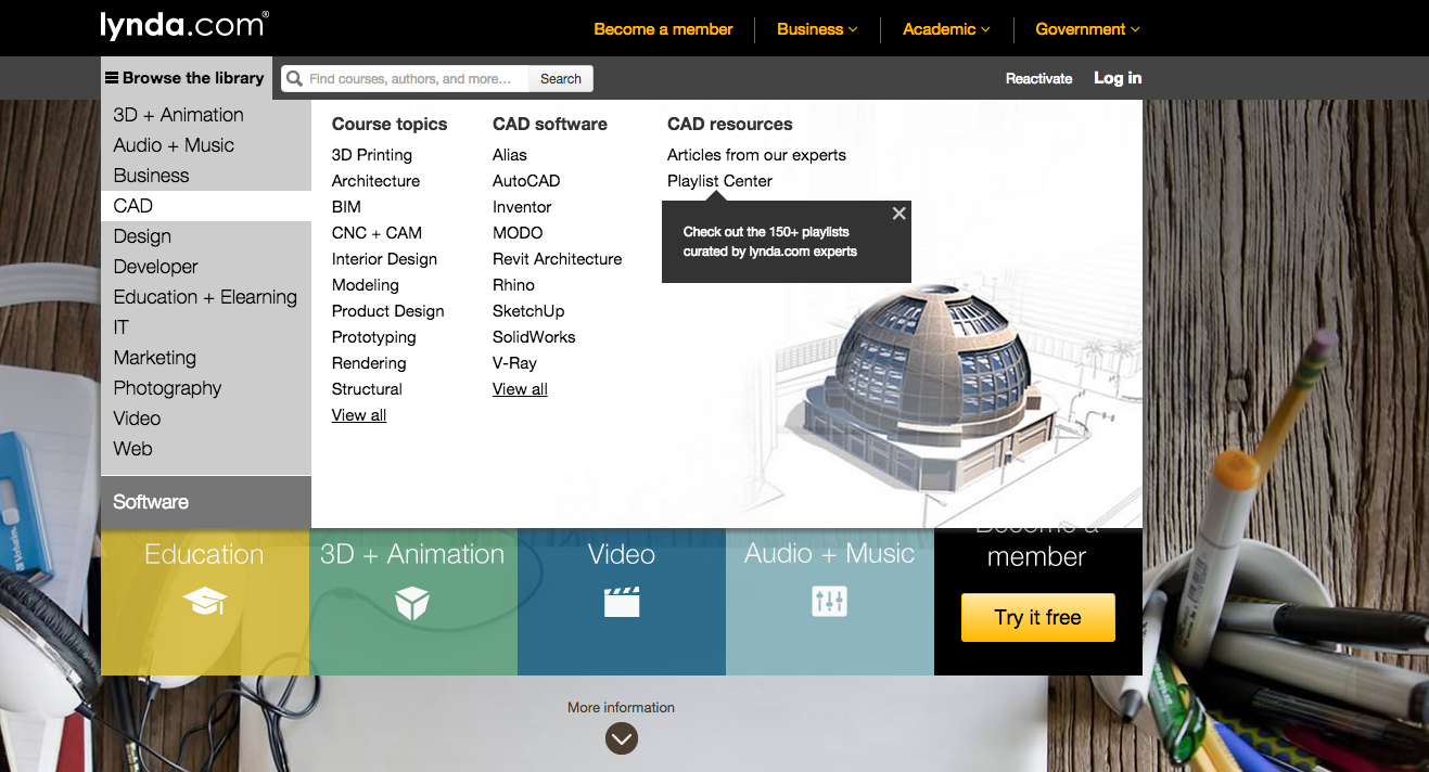
There is one thing that the full-website can do better than any mobile app, and that is manage huge amounts of information in large, well-categorized menus. Take for example, Lynda.com. This is a site with lots and lots of content. The mega-menu, as its called, is essential here. We can really capitalize on the massive amount of screen real estate available to make sure that the user can find what he or she wants quickly and efficiently.
Lynda.com has a responsive site, a mobile website as well as an app. Why all three?! The mobile site is meant for mobile phones – in which case it is inefficient for users to scroll through a ton of category options, so it just serves up the options in alphabetical order – a completely different menu. The responsive site fits in the obscure screen sizes that fit in-between, or ones that the browser-detection can’t get a handle on what sort of device you’re using. Lastly, the mobile site reminds the user to grab the app – which should always be done for mobile users when an app is available. Apps are preferable for repetitive tasks on mobile devices because: 1) they are optimized for mobile devices and can leverage the full processing power of the mobile CPU and 2) apps reduce the number of steps your users has to go through to access the content (versus entering the web address in a mobile browser).
Just because the mobile web and app space are encroaching on the PC’s turf doesn’t mean that the PC viewport isn’t important. [inlinetweet prefix=”” tweeter=”” suffix=””] The full-blown PC-friendly web experience should be your brand’s Cadillac – big, bold, and beautiful.[/inlinetweet]
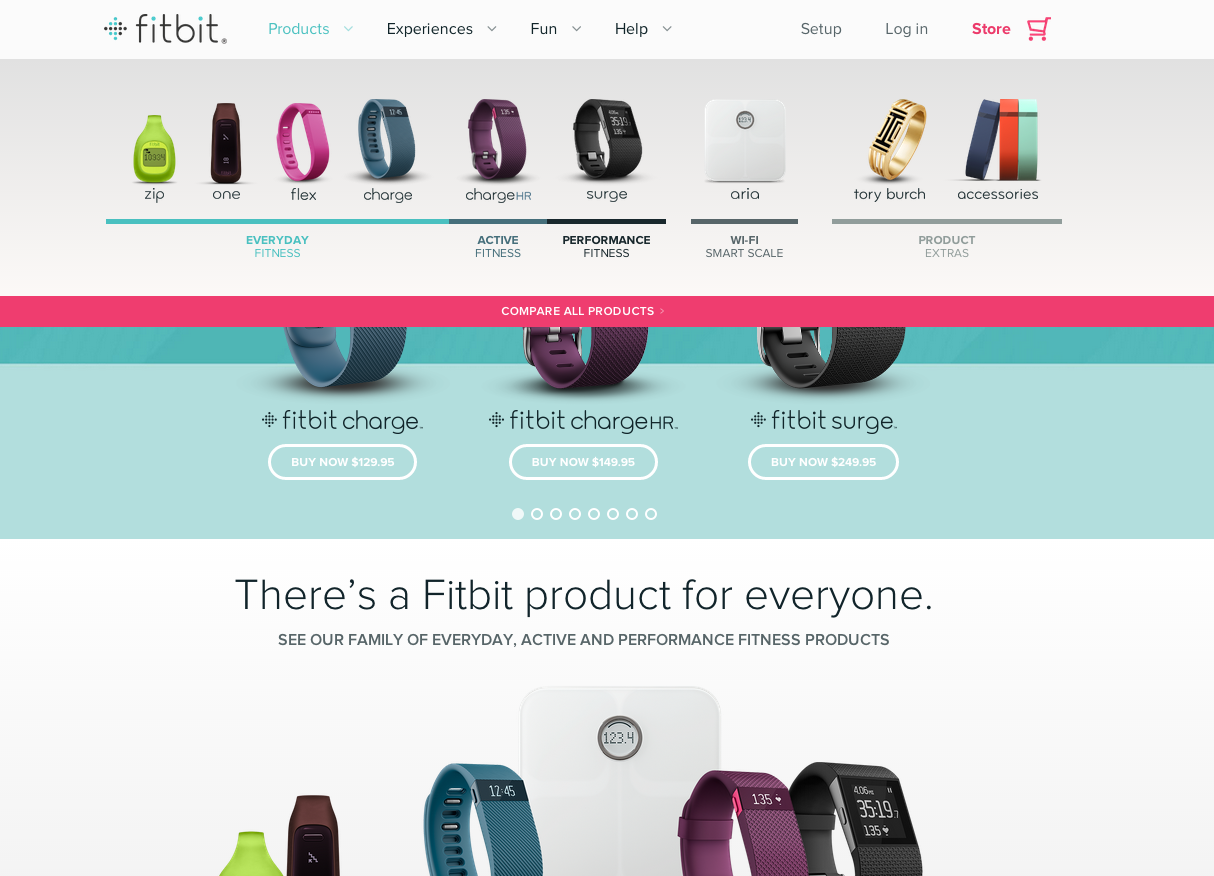
Here’s the absolutely gorgeous yet clean website for Fitbit. Note the menu; it’s chock-full of beautiful high-quality images. PC’s are more powerful than ever before, and internet speeds are the fastest they’ve ever been, so we don’t need to worry about page-load times like we used to in the Web 2.0 era.
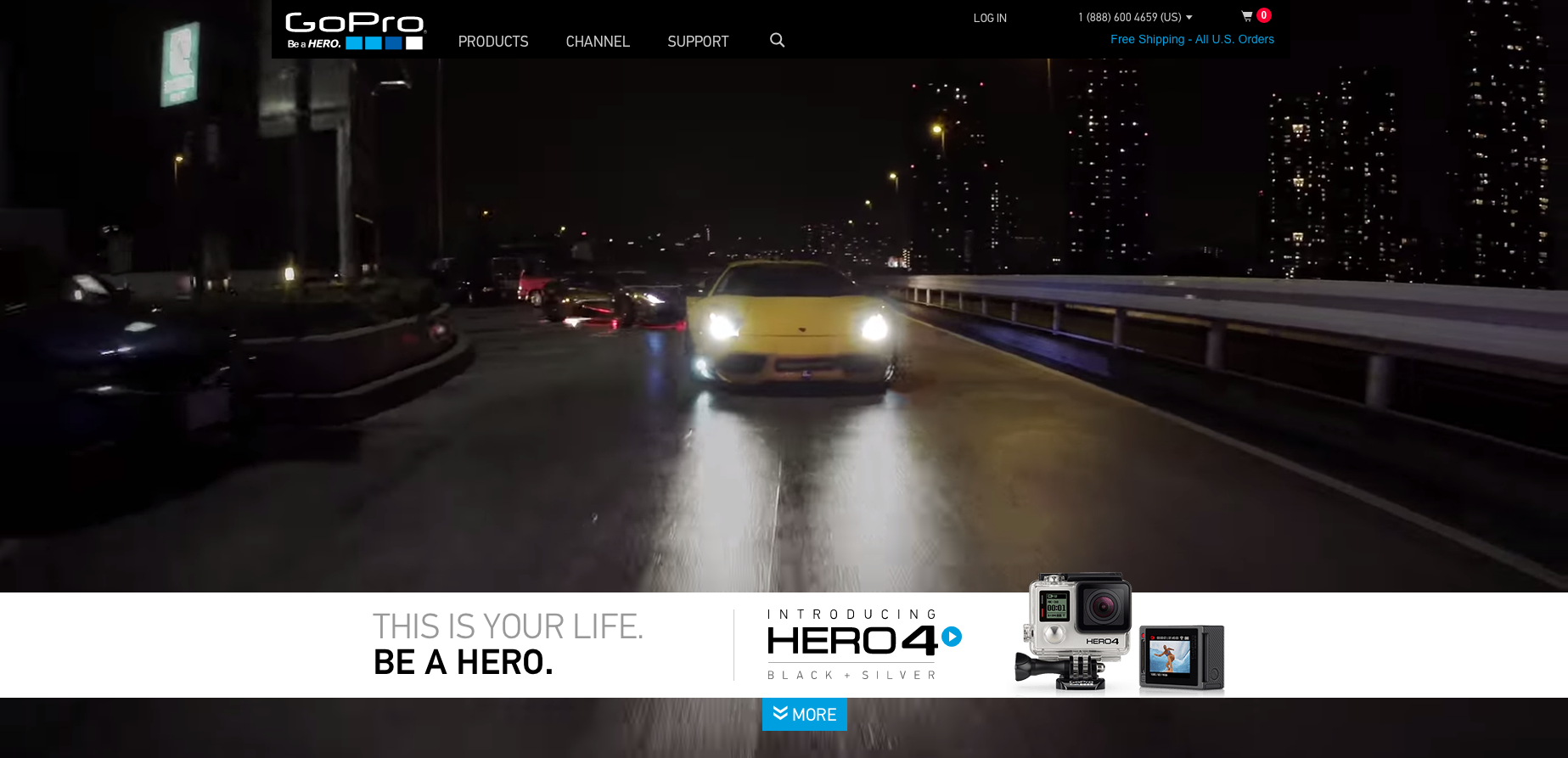
GoPro’s website is one of our favorites for 2015. PC users are treated to a delightful full-screen epic video montage, which was undoubtedly created with GoPro cameras. The essence of the brand jumps right out at you, as if to say, “look at all the exciting things you can do with our cameras!” What I love about this website is that it gleefully breaks all the rules of web design that we were taught back in 2008. “Be careful about rich media,” they told us, “people don’t like auto-playing video and audio, it’s annoying to them and it slows their browsing speed down.”
Well lookey here. It’s a different world in 2015 – we’re cutting our cables and streaming full HD movies and TV shows on the fly. Today’s low-end laptop packs more computing power than your average Roku box or Fire TV. So, a full-screen music video? Why not? The GoPro website still follows all of the basic rules of user-engagement. The call-to-action is still in the bottom-right. You can scroll down and still get to all the good stuff. The navigation is easy to use, and it’s full of nice pictures. Did you notice they don’t care about “the fold?” That’s because we’ve discovered “the fold” to be a mythological beast, like the yeti. Some people have claimed to have seen it, but nobody can really tell where it is or when it will show up. Maybe this is why:
(Source: W3Schools.com)
So as of January of 2014, the most popular screen resolutions were 1366px wide and “other” sizes above 1920px! The 1280x1024px “standard” now accounts for only 8% of screens and only 6% of screens are 1024 wide. Almost nobody has a screen that is less than 1000px wide, so why on earth are we still designing the “Cadillac” web experience at 1000px?! The bulk of the GoPro site can be experienced at 1200px and there are some other goodies that can be seen at 1900, perfect.
Gamification as a multifaceted engagement-cycle
[inlinetweet prefix=”” tweeter=”” suffix=””]Gamification should reinforce behaviors the user already engages in. This means that the reward for playing the game or contest should feed in to what the user already does, what the user already wants, and what you want the user to do.[/inlinetweet]
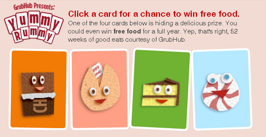
A good example is GrubHub’s game Yummy Rummy. After you place your order, you can pick one of these cards at random. If you “turn over” the right card, you will win free food in your next order. Yummy Rummy is a perfect game because the users are already using GrubHub to order food, so why wouldn’t they play it? This may seem obvious, but do you remember how random, unrelated contests used to be all the rage in marketing? “Fill out this survey for a chance to win an all-expenses paid trip to Tahiti!” Who says that I even want to go to Tahiti?
The GrubHub Yummy Rummy game reinforces existing behavior, but I wouldn’t call it multifaceted. A multifaceted approach could encourage users to share their experiences or build a custom social networking experience at the same time.

This contest by GoPro not only has a nice reward, but it also encourages users to share their GoPro-created content with the rest of the community. Undoubtedly GoPro users are getting some pretty awesome footage. The fans should be the primary source of marketable content, not only does this save money for the company, but it’s honest and more fun.
One of the best examples of multifaceted gamification that I’ve seen was the eBay Garage giveaway. One niche market that no other commerce site (even Amazon.com) has been able to top eBay in is with aftermarket auto parts and accessories. eBay captured this niche early, and attracted lots of quality 3rd party sellers. Some smart executives over at eBay thought to build an online community for their niche of loyal auto enthusiasts. To do this eBay launched a multifaceted approach:
- Added functionality: Users could save the year/make and model of their vehicle in what they called their “eBay garage.” Users no longer had to enter this information every time, and their searches could be catered to the vehicle that they already had.
- Encourage user engagement with a contest: eBay then put up the grand prize – a brand-new Tesla Model S. It’s what users were required to do to enter the contest that was novel and interesting. For each photo you uploaded of your car to your eBay garage, you got a chance to win the Tesla. With each photo you shared on Facebook, you got a chance to enter, and with each friend you got to sign up for eBay garage, you got more chances to enter. Not only was this a brilliant viral-marketing approach, but it also encouraged contestants to build up their eBay garage profile.
- A social network is born. Now users can comment and vote on each other’s car photos. Auto enthusiasts can share tips and meeting information. Sellers and buyers have a new way to reach each other, and eBay can continue to assert its dominance as the go-to place for aftermarket auto parts.
To conclude the UX Trends and Tombstones for 2015 series:
- It is critical to optimize your website for mobile and tablet users, either with a responsive website, a mobile website, a mobile app, or (preferably) a combination of all three.
- Google will now be favoring mobile-friendly sites in their mobile search results. For a full report, read this piece by Ripe Media’s own Tech Strategist, Chris Simental.
- If you can make the case for a companion app for your website you should probably create one, or leverage existing apps. For example, it would make sense for Domino’s pizza to create a pizza-ordering app, but not for a local pizzeria with only one location, in which case leveraging an existing app such as GrubHub would be a good move.
- Forget about sounding cold and professional, no matter what you sell. It is good to be warm, friendly and even funny and cute with your users.
- Optimize your PC experience for powerful, ultra-wide displays, and make your menus large, rich and engaging when appropriate.
- Introduce gamification to reinforce existing behaviors, or build new behaviors such as social-network building or photo sharing.
You Might Also Like
Related Posts
Share this: