THE RIPE STUFF
5 Feb ‘15
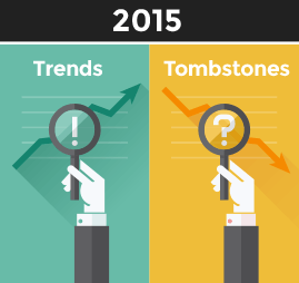
UX Trends and Tombstones for 2015: Part 1
5 Feb ‘15
In: Innovation, Mobile App Design & Development, Technology, User Experience Design, / By: Ripe Media

2014 has been an amazing year for user experience design. There are some trends in UX that we’re sure you’re aware of; like the ever-increasing prevalence of mobile browsing and the encroachment of use-specific apps on the entirety of the mobile web space. There are also some less-obvious factoids like the (gasp!) elimination of the 1000-pixel browser standard and the niche-ification of the PC altogether. There are also some “tombstones,” that is, some trends in UX that are dead, but you can still find some bad examples lurking around. We’ll be sure to touch on those so that your website doesn’t look like a lingering zombie from the 2010 era. Yes, ‘era.’ In the digital world, five years could just as well be called an ‘aeon!’
What exactly is “UX?”
Before we get into what will make for good and bad UX in 2015, we think that it is important to briefly discuss what UX actually is. This is the subject of some pretty intense debate in-of itself, largely because people have been doing “UX design” before it was even a “thing,” meaning that UX is a conglomeration of practices that companies have been doing, before it even had a name and was codified as a legitimate discipline.
Here’s Wikipedia’s definition:
“User experience design (UXD or UED) is the process of enhancing user satisfaction by improving the usability, ease of use, and pleasure provided in the interaction between the user and the product. User experience design encompasses traditional human–computer interaction (HCI) design, and extends it by addressing all aspects of a product or service as perceived by users.”
Now “improving usability, ease of use and pleasure” are all well and good, but typically speaking when producing UX deliverables for a client, you’ll be doing it because the client has a goal in mind – that is, a behavior or series of behaviors that they want their users to engage in. This could be making a purchase, or simply helping them to find the information they need, or to encourage them to sign up for an email newsletter. It just so happens that (not too surprisingly), users are more likely to do what you’d like them to do, and do it repeatedly, when they have an easy and fun time doing it!
So, UX is a discipline and a philosophy that encompasses branding, visual design, interaction design, information architecture, usability and psychology. The tools that we use to conduct UX design range from observation, to questionnaires, research, brainstorming, development, design and prototyping. So, in short, UX design is not just what is functional or what looks good, although you need both of those things to ensure “good UX.”
UX helps us to find a peaceful medium between the age-old battle between design and functionality. Obviously if something is pretty but unusable or not powerful enough, we don’t want that (to this I point a finger at Apple for their Pages app). Then again, if something is ugly and just plain unpleasant, we might not want to use it or buy it at all, and that would defeat the whole purpose.
At Ripe Media, we concluded a real-world usability test when we were trying to decide on a Project Management system. We had been using Asana for quite some time. Asana is attractive, intuitive and very easy to use. Then we thought to migrate to Intervals. Intervals is a powerful web-based application that allows for some very advanced fine-tuning over budgets and financial data on a per-project basis.
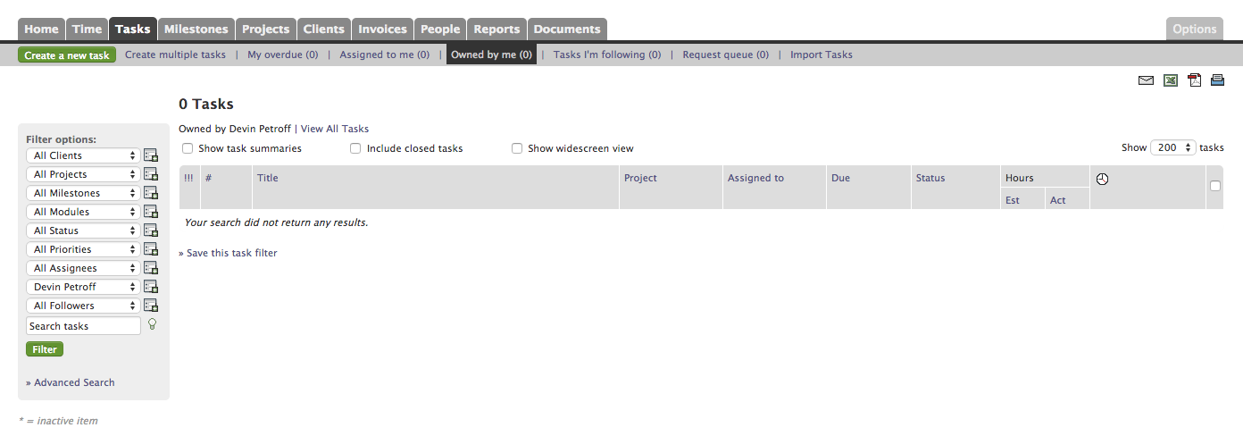
The problem with Intervals is that it’s a chore to use. It’s such a chore, in fact, that you practically need a manual in order to use it. The menus are confusing, and tasks must be done in a hard, forced-linear way. If you get the task-production order wrong, you just can’t do it. I have wasted more than a few good billable hours explaining to our engineers (who are very smart and technical people), how to update their tasks and where to add hours and how to add timesheets. I have written lengthy tasks for people only to later find that I couldn’t add that person to a project on the fly, and had to redo that work all over again. Last but not least, Intervals is ugly, it has no sex-appeal, and it’s just no fun. You might dismiss these latter points as unimportant, but are they? If the application is something that is meant to be a part of your process, it definitely matters if the application is attractive and fun to use. Why? Because fun and joy help to encourage people to do things!
One of our Senior PM’s put it this way, “Intervals is just another thing on my to-do list. It’s another chore. It gets in the way. It doesn’t fit into my workflow.” This was definitely true and it showed – our people had to be nagged to use Intervals, which showed us that the UX was so bad that people didn’t want to use it.
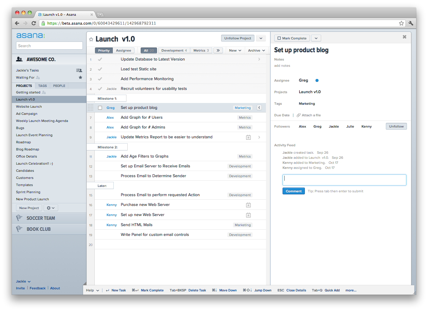
Ah, Asana. It’s clean and straightforward. It has a beautiful mobile app (get a clue, Intervals). It’s light and quick, and nobody yet seems to be confused about how to pick up and start using it from the get-go with zero instruction (a major goal of UX). It has no integrated time-tracking, but we found that Harvest does a great job doing that. What’s best is that Asana is pretty and fun to use, and that makes people more likely to use it! Asana is easy to use, so hours of productivity are not lost. Asana keeps you in the groove and helps you do what you need to do, instead of demanding your attention be focused on figuring it out, meaning that Asana helps us do our tasks instead of becoming a task in of itself.
So, lesson learned. It isn’t always that design wins over functionality or vice-versa. Rather, it’s a balancing act, and its one that you have to conduct with your users in mind.
Mark Tilden’s B.E.A.M. Theory
One of the best guidelines that I think makes for great UX comes from someone who has no history in web design or “UX.” Mark Tilden is a leading voice in robotics design, aimed primarily at helping designers create robots that acted and interacted like living things. Tilden codified his philosophy as B.E.A.M. robotics, which, with a small “tweak” I think sums up good UX design pretty nicely:
B is for Biology – This is the psychological and social aspect of UX. What do people naturally do? What motivates them?
E is for, not Electronics – this was Tilden’s point on creating good circuitry. For our purposes I’d like to replace “Electronics” with “Efficiency” – Fewer steps are better. Find a way to cut down on the number of steps that users have to go through. This will increase user engagement, minimize lost visitors and users.
A is for Aesthetics – Is it pretty and fun to use? Attractiveness affects the user’s willingness to use the system!
M is for Mechanics – In our case, we can simply call this “code.” Is it well engineered? Is it fast, efficient and reliable? Are we using the best technologies for the job?
So, one final point about UX and what it is. UX is not simply “wireframes and prototyping.” This would mean that UX is simply a crude attempt at design. UX design is an overarching philosophy centered around optimizing user involvement and engagement. The entire process, from sales, to customer service, to delivery, should be a good user experience, and therefore worthy of user experience design.
To be continued in Part 2!
– Devin Petroff, Ripe IA/UX Strategist
You Might Also Like
Related Posts
Share this: