THE RIPE STUFF
6 Sep ‘18
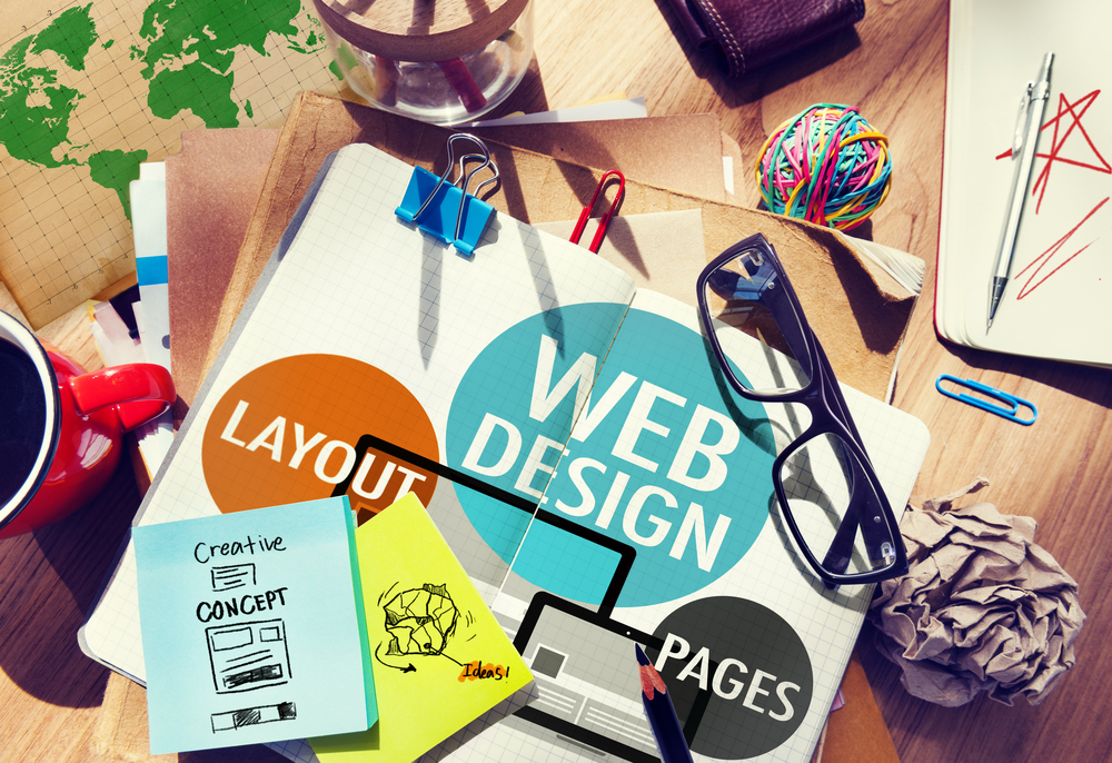
How to Improve Your Website in 7 Easy Steps
6 Sep ‘18
In: Web Design & Development, Branding & Visual Design, User Experience Design, / By: Ripe Media
Since the inception of the internet in the 1960s, it has transformed from a military experiment into a huge, evolving organism that’s filled with subcultures and oddities. Chances are, you have your own corner carved out in this massive “beast.”
As a website owner, you have a lot on your shoulders. You have to create something that’s visually attractive, engaging and interesting. After all, that’s the only way you can get and keep traffic.
The good news is, with more than 8.7 billion devices connected to the internet at any given time, you have a good chance of at least a few people finding you. However, what do you do if your website isn’t quite as good as you hoped it would be?
If you are facing this dilemma, take heart in the fact that you aren’t alone. Also, use the tips found here on how to improve your website.
1. Create a Value Proposition
Your website’s value proposition is essentially the mission statement. It tells your visitors what you do and what motivates you to do it.
Even if you are trying to improve a personally owned website, such as your blog, having a value proposition can be beneficial. It provides context and shows the value your site has.
Make sure the value proposition is on your site’s home page and in the headline, if possible. Add it to the about page or blog, too. Let visitors to the site know exactly what they are getting if they read your blog, subscribe to your newsletter, buy your product or hire you.
Creating a value proposition (if you don’t have one) isn’t difficult. Make sure to include the following:
- (your company) is where
- (your audience) gets
- (information) offered
- (what benefit)
For example, “The Cutting Edge (your company) is where savvy homeowners (your audience) can find professional, reputable lawn care services (information/services offered). Our goal is to help you get quality lawn care services when you need them (what benefit).”
2. Improve or Create a Logo
When discussing website design, the old adage is true – you have just one chance to make a first impression. For many people, your website is the first impression visitors/customers get.
As a result, appearance counts. This is the online “entryway” to your business. Your business’s logo is the first indicator visitors use to judge the quality of your site and the professionalism of your business.
To create an amazing logo, avoid using free themes. This can make your site feel and look generic. If you can’t afford to hire a graphic artist for an original design, considered an outsourced site where you can hire someone for a lower price.
3. Your Site’s Navigation
The navigation present on your site has two main purposes:
- To help visitors find what they are searching for
- To help improve your site’s search engine rankings
Visitors always come first – search engines second. Use descriptive navigation, rather than generic “What We Do,” phrases. Use the words that visitors would use and ones they are searching for.
Pro tip: Don’t use any type of internal lingo or jargon. If you try to be clever, it’s going to turn potential clients off. No one will know what “RTT Buzz,” means, if it’s your blog, say “Blog.”
4. Create Relevant Content
If you want to attract and keep people on your site, you have to give them what they want. That is relevant, fresh content. Your pages need to engage your visitors, not offer a hard sell.
If your site uses all types of sales language, such as “buy now,” “we are number one,” and “why we are the best,” it’s going to be a turn-off. Consider using things such as “testimonials,” “videos,” and “educational tips.” This offers a much higher level of value.
Try to provide useful content that lets visitors know if they are in the right place. By doing this, you will be considered an “expert” in your field, which will encourage visitors to keep coming back.
Also, minimize distractions and place your calls to action in strategic locations. This will help provide the best possible results.
5. Call to Action Colors
Calls to action were mentioned earlier. While they need to be located strategically, they also need to draw a visitor’s eye. A great way to do this is by finding a contrasting or accent color.
For example, if you have a site that is mostly light blue or blue, then use a warm orange or yellow for your CTA. By using this contrasting color, it will let visitors know what to click on and what will happen when they do.
6. Add Videos
Video marketing is, by far, one of the hottest marketing trends being used by websites today. They can effectively grab visitor’s attention and offers a message that’s more direct than words alone.
Also, professionally made videos add to the credibility and professionalism of your service or product. What’s even better – you don’t have to be seen in the video you create.
7. Social Proof
You can use social proof to help entice people to download your ebook or sign up for your newsletter. Have influencers that are in your industry provide a testimonial or quote. This is beneficial, and your visitors will trust you more.
How to Improve Your Website: Now You Know
If you want to know how to improve your website, the seven tips here are a great place to start. However, don’t stop there. There are countless ways you can improve the experience visitors have on your site.
If you would like to create an incredible website, we’re here to help. Contact us today!
You Might Also Like
Related Posts

Share this: