
24 Mar ‘15
Get mobile-friendly now or risk being shut out
24 Mar ‘15
In: Mobile App Design & Development, Search Engine Optimization (SEO), User Experience Design, / By: Chris Simental
Starting April 21, Google will start favoring mobile-friendly websites in its mobile search results. In other words: Companies need to get their websites mobile-friendly right now or they’ll start losing traffic from Google.
From Google’s Webmaster Central Blog: “Starting April 21, we will be expanding our use of mobile-friendliness as a ranking signal. This change will affect mobile searches in all languages worldwide and will have a significant impact in our search results.”
We’ve all had less-than ideal experiences when trying to work with non-mobile-friendly websites on smartphones and tablets, but until this change was announced, it was just a minor annoyance and had no impact on the search engine rankings of the website. Now, though, it’s serious. Non-mobile-friendly websites will start dropping off the list of results. Google goes on to say that this change means “users will find it easier to get relevant, high quality search results that are optimized for their devices” and we agree wholeheartedly, but it means organizations without a mobile-friendly site better get on it quickly or risk losing traffic from Google starting April 21.
So, how do I know if my site is mobile-friendly?
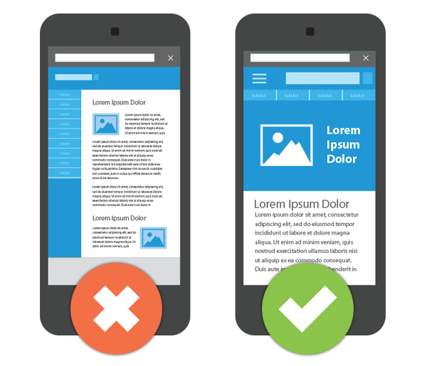
Aside from just looking at a site on a mobile device, there is a more empirical way to determine if a site is mobile friendly. Google provides a Mobile-Friendly Test app that identifies basic mobile display issues like font size/legibility, inclusion of a mobile viewport tag, spacing of links (to favor fingers, not mouse pointers), and the overall width of the content. This tool is a great first step in figuring out if and what changes need to be made to make a site more mobile-friendly.
Does that mean I need a full mobile-friendly redesign?
No, not necessarily. According to Search Engine Land, the algorithm runs on a page by page basis, “So if you have 10 web pages on your web site and 5 of them are mobile-friendly and 5 are not, then only the pages that are mobile-friendly will benefit…Many websites have sub-sections or specialized pages that would be hard to make mobile-friendly, so webmasters do not need to fret about going 100% mobile-friendly by April 21st.”
That said, it is highly recommended that all pages in a site be made mobile-friendly, but it’s good to know the work can be done on a page-by-page basis if needed since some sites and/or sections/pages can be more complex than others to convert.
The Ripe Way
At RIPE, we’ve helped many of our clients successfully navigate the murky waters of mobile-friendliness. The approach we use is Responsive Web Design (RWD), which adapts the layout of a website using a fluid grid concept, flexible images, and CSS3 media queries. In some cases we’ve done this on a page-by-page basis and in other cases we’ve done full RWD site redesigns. While a new design from the ground up can sometimes result in a better user experience, there are times when that just isn’t a possibility due to the complexity of the site or rigidity in the Content Management System (CMS). In those cases a redesign makes more sense.
In the next installment I’ll share some examples of RIPE’s Responsive Web Design projects.
You Might Also Like
Related Posts


Share this: